Applying Zach Gage's three reads to our UI

Here is an early version of our lobby screen. We realised there were a few problems with this design however. Especially after watching Zach Gage's brilliant GDC-talk Building Games That Can Be Understood at a Glance
- The word “lobby” takes up way too much space. Since it’s the biggest text on the page one tester even thought it was the name of our game. In reality, it’s useless information. People don’t care that this is the lobby screen.
- The URL is too small. The most important thing players need to know is which URL to enter.
- “First to 15 points wins”. Players won’t know what a point is before playing the game. How do you get them? What are they worth? And so forth. And actually they don’t need to know how many points you need to win at this point. This information is only relevant to experienced players, that understand how points work.
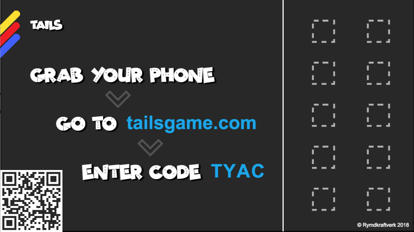
This is our current lobby screen as of July 2019. The instructions on how to join are the most important things, so the text is big and in the middle of the screen. They also follow a flow from top to bottom, so it’s as clear as possible what the steps are to join. ALL Players will need to read and understand these, in order to even play the game. This is what Zach calls the first read.
We also added "grab your phone" to the instructions, to help the players understand that they need to enter the URL on their phones. We toyed with some other phrases, such as "open your phone's browser", but ultimately decided that we wanted to keep it as short as possible. Most players will hopefully be accustomed to opening a browser when they see the suffix ".com".
The title of the game is less important, so that text is smaller. Realistically, people will already know what game they are playing, so this is only relevant to new players who join later or people just walking by the screen while the game is running. This would fall into either the second or third read.
The squares on the right will fill up once a player joins. This can be useful information in some situations. When players get more experienced they will be able to tell how many players have joined, and can then wait for those who haven't. But it's definitely not helpful for beginners. This section could probably be made even smaller, to allow for the instructions to stand out even more.
The information that we are on the "lobby" screen and how many points you need to win is removed, since it's completely useless information at this point, and just adds noise for the players. Instead we present the points after the players have finished their first round. Giving them a chance to learn the basics of the game before the win condition is presented to them.
/ Rymdkraftverk
Leave a comment
Log in with itch.io to leave a comment.